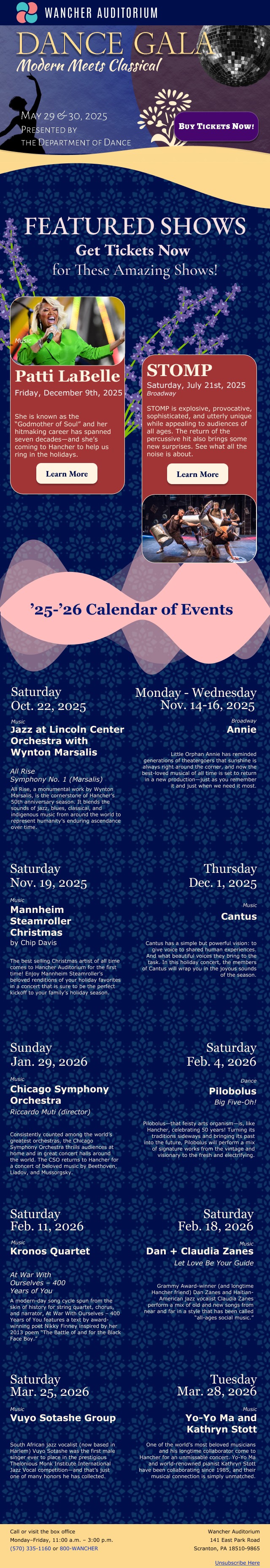
For this class assignment, we had to create an HTML email with a header, promo area, cards for the "featured shows", a calendar of events, and a footer, all with rich transitions and visually appealing pieces to them. We could use any fonts in the promo area, as it was an image, but the rest of the email had to contain web-safe fonts. Because we couldn't vary our fonts too much, we had to be creative in constructing hierarchy within the typesetting and in finding contrast. Below is my desktop version of my email, and within it I use rich transitions and made sure to make each decision a conscious one. All of my fonts are different, yet tie together to create a cohesive theme. My promo area is elegant yet fun, setting the tone for the rest of the email. My cards look realistic and still provide all the necessary information. My calendar of events is well spaced to avoid cognitive overload, but still has cohesion within the intraunit spacing. My footer is simple with good readability contrast, as well as a realistic hyperlink. Overall, I feel that this project challenged my communication abilities through the limited web-safe font choices, specifically. Trying to create hierarchy without being able to fully change the font or location of the text was difficult to achieve at first, but after this project, I feel much more confident in it. With that, this project also helped me realize that I struggle with transitioning between units. Creating rich transitions was difficult to do, as I chunked out each piece as "separate" in my mind, but it helped me to realize how much of a singular piece that design is.